
The design of borefields is typically done by looking at the temperature profile of the system. Although rather straightforward to interpret, it leaves out some important design information. Today, we introduce contour plots and maps in GHEtool Cloud that can help fill that gap and support you in designing borefields with even more confidence!
Contour plots
Temperature profiles are a great way to show how the fluid and borehole wall temperature of a system evolve over time. Especially when working with hourly data, you can get quite a lot of information out of these graphs. However, they do not tell you the whole story, since the temperature in the ground is not constant everywhere and depends heavily on both your borefield configuration and your imbalance. With the introduction of contour plots, we can make this visual.
To illustrate this point, consider the temperature profile below.

Here, there is a rather significant imbalance, cooling the ground down year after year. However, the temperatures shown below are all average temperatures, where the borehole wall temperature is the average for all boreholes. To gain more spatial insight, let us take a look at the corresponding contour plot of this borefield.
!Hint
You can create a contour plot in GHEtool Cloud by going to the ‘General’ tab in the ‘Aim specific settings’. These plots are available in all aims except the TRT analysis.

The contour plot above shows a two dimensional temperature distribution in the ground, both in and outside the borefield after n years, in this case 25. Here, the contours are isothermal lines where the temperature decreases by a certain number of degrees with respect to the initial undisturbed ground temperature. The imbalance is also clearly visible in this graphical representation, since all contour lines are negative, indicating the overall cooling of the ground.
Besides that, it is visible that the temperature drift is not identical everywhere, as indicated by both the isothermal lines and the temperature gradient. The centre of the borefield has a darker blue colour, indicating a more pronounced temperature disturbance, whereas the outer regions of the borefield are cooled less. When going outside the borefield, one can expect a temperature disturbance of −1°C at a distance of 30 m in this case.
This spatial representation also gives some extra insight into how one should interpret interference between neighbouring systems, as will be discussed next.
!Note
These contour lines are an estimate of reality, since they are only a two dimensional representation of a purely conductive system. They are created by taking the imbalance of the system and distributing it across the different boreholes. Since not all boreholes have the same contribution to the thermal interaction, as discussed last time, the imbalance caused by certain boreholes will be more pronounced. In the end, by taking the infinite line source assumption and summing all the contributions of the different boreholes, these graphs are created.
Contour plots and interference
Since contour plots are an excellent way to show the temperature distribution both in and outside the borefield, they can help to visualise the thermal interference between different borefields. Previously, this thermal interference, as discussed here, was expressed numerically, quantifying the long-term temperature influence of one borefield on another. With the help of these graphs, this interference becomes visible, as shown below.

In the graph above, it is clear that the individual imbalance of each borefield is stretched towards the neighbouring ones, creating one collective temperature influence. Of course, the temperature disturbance is greatest inside the borefields themselves, but over the years, this influence spreads. This is clear when comparing the image above, after 25 years, with the situation after only one year of imbalance.
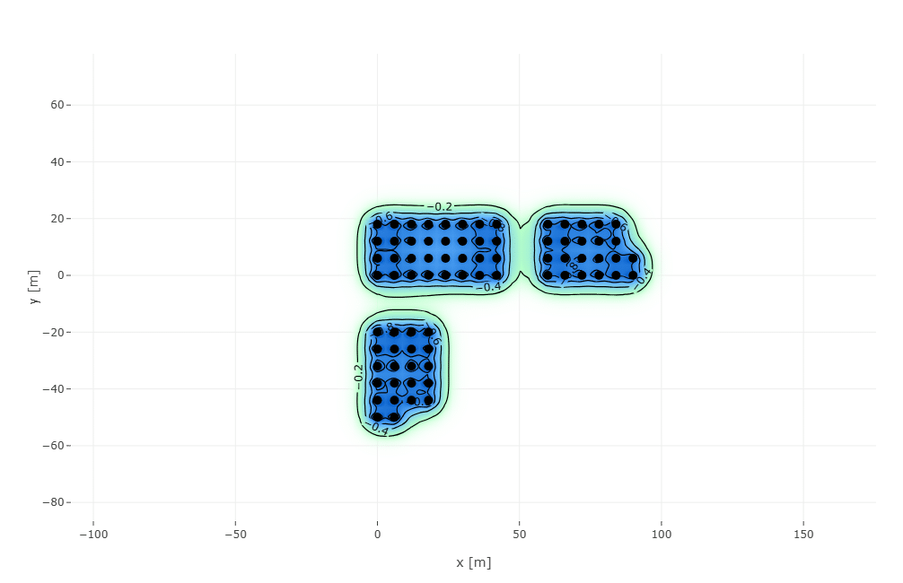
After only 1 year, the interference is far less pronounced, as there is almost negligible interference between the top left borefield and the one at the bottom. Due to the yearly imbalance, this region of influence grows over the years, increasing the thermal interaction between the different systems. This can also be visualised in GHEtool Cloud, where it is possible to animate the contour plots for every year of the simulation period. Below, this is done for the situation of the thermal interference above.
Contour plots and borefield configuration
Besides visualising the interference between different borefields, contour plots can also help us to understand the importance of the borefield configuration when dealing with imbalance. Previously, when talking about how to cope with imbalance (read the article here) or when introducing g-functions (read the article here), it was always mentioned that increasing your borehole to borehole spacing, as well as putting your borefields in a line, was better for the long-term behaviour of your system. With the help of contour plots, this can now be visualised.
Below, the contour plot is shown for a system with a significant negative imbalance, for both a borefield of 9 boreholes of 130 m in a line and in a grid of 3 × 3.

When comparing both contours next to each other, it is clear that the cold is more trapped inside the borefield when the boreholes are placed on a rectangular grid. The temperature inside this borefield drifts, after 25 years, to −5.3°C when compared to the undisturbed ground temperature, whereas in the case of a line, the temperature only drops by 4°C. This again gives extra insight into the importance of the configuration of the borefield and will be particularly useful when dealing with irregular configurations.

Contour plot of a borefield with 3×3 boreholes.
!Note
When hovering over the plot with your mouse, you can see the temperature disturbance at that particular location. When selecting a borehole, you can see its contribution to the overall imbalance of the borefield. In the case above, the borehole in the middle has a significantly lower specific heat extraction than the boreholes at the edge or corners. This is because the temperature surrounding this inner borehole is already lower, limiting the extraction capabilities.
Maps
A second update that can help you design your borefields more easily is to place your coordinates directly on a map. As of today, when working with custom borefield configurations, you have the option to select a map as a background, as shown below.

When you are working with coordinates in GHEtool, you can use either your own locally defined reference frame, starting for example at (0,0), or a national coordinate system. In any case, you need to map your local coordinate system to the map. Therefore, you simply select one point on the map and reference it to the coordinate corresponding to your own coordinate system. In the case above, the black yellow dot overlaps with the (0,0) point of the coordinate system at hand. You then end up with the figure below.

Now, one can easily drag and drop coordinates to the right location, as well as add new boreholes by either right clicking or double clicking left. That way, designing your borefield configuration becomes easier than ever before.
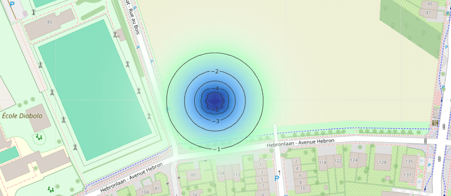
Another advantage of working with a background map for your borefields is that your contour plots will now be shown on top of these maps. This makes it even easier to evaluate the thermal interaction with the surrounding systems, as shown below.
!Note
One can also draw the interference calculation on a map, but there too, the reference point should be set accurately so that the borefield is drawn in the correct location.
Conclusion
With the introduction of contour plots, it becomes easier to gain insight into the long-term thermal behaviour of your geothermal system, both inside and outside your borefield. It can help you to understand and visualise the thermal interference between neighbouring systems, but also to showcase the importance of the borefield configuration itself. This feature, combined with the new map functionality in GHEtool, empowers you to design borefields more easily and with more confidence!
References
- Watch our video explanation over on our YouTube page by clicking here.